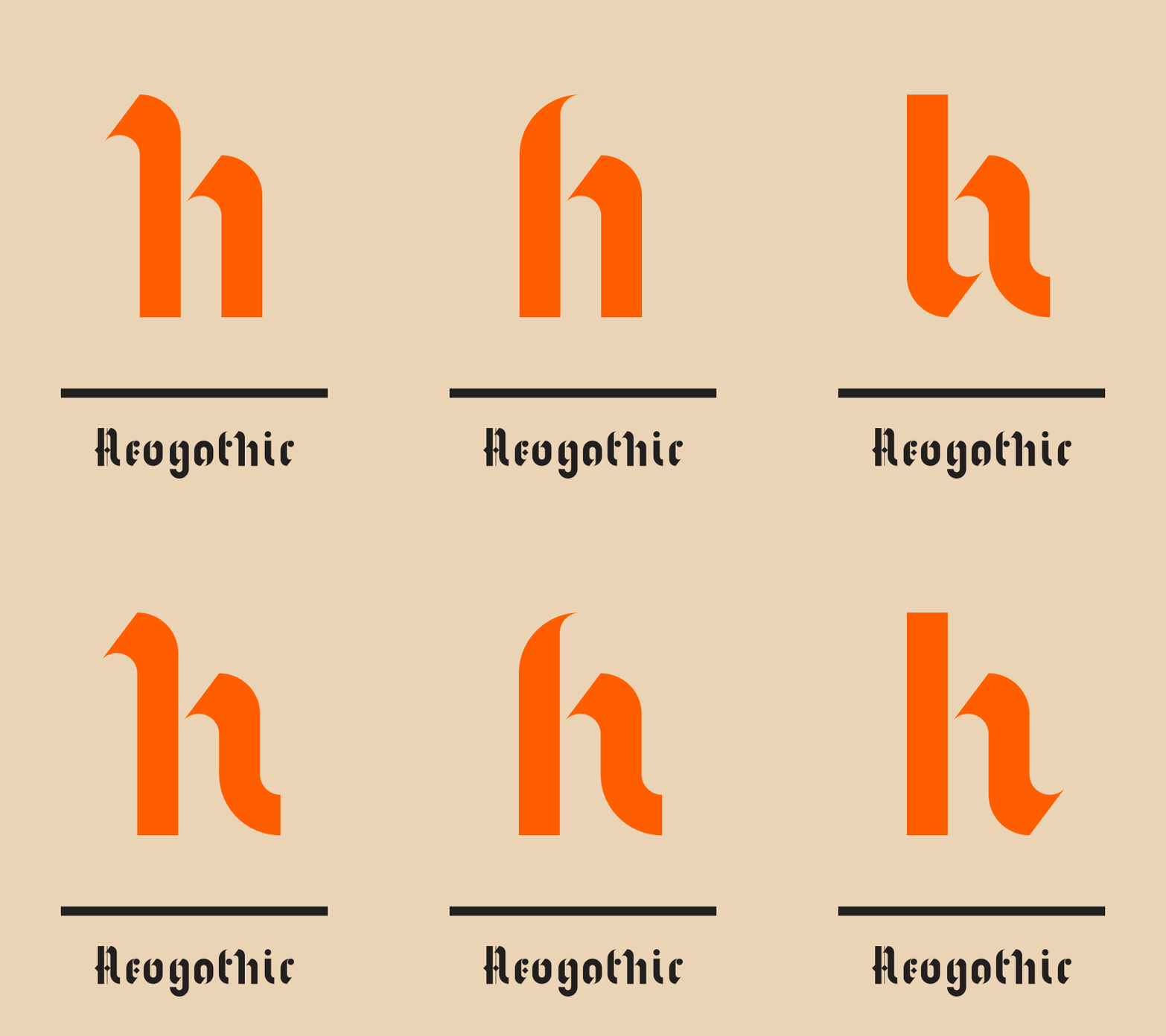
I surprisingly enjoyed sketching the letters. Going Uppercase was definitely the way to go and I'm really pleased with how each of the letters turned out. They embody both wind and energy like I intended. However, when I went to upscale the sketches from 1.25 inches to 5 inches I found it was very difficult to make 26 clean large scale mockups because the turbine shape is so odd and the lines are so thin that the sketches were worse than they were better. With the small sketches the line weights are more consistent and once scanned in I expect will create cleaner vectors to work from. Additionally, I am still making decisions on a few of the letter designs and working from the smaller sketches helps keep those options open.
Tuesday, January 27, 2015
Thursday, January 22, 2015
Wednesday, January 21, 2015
10 Modular TypeFaces
The elements of wind, energy, power, and industry will be prevalent in the typeface I am creating and these all exemplify qualities I'd be proud to display in my own work. I chose these because they are functional and readable, some more than others, while still having a strong voice.
Tuesday, January 13, 2015
Project 1: Brainstorming [In Progress]
Possible Conferences/Ideas:
Wind Energy // Turbines
Photography // Fashion/Lifestyle
Perhaps workshops instead of world conferences?
Instagram Meet ups [could be interesting]
High End Retouching
Contortion Convention
Hot Tea Convention? lol
As of right now Wind Energy and Contortion seem like the two most unique and intriguing topics.
Subscribe to:
Posts (Atom)


